
Designing May, a B2B SaaS at the intersection of HR, finance and open banking
May is a B2B SaaS for employee benefits, sitting at the intersection of HR, finance and open banking. I led design across four major surfaces: bank-account onboarding, mobile OCR receipts, the admin dashboard, and a fully re-imagined company onboarding that auto-configures benefits based on the company's size, budget, CSE and HR goals.
Context
Employee-benefits SaaS is one of the harder B2B problem spaces: three audiences (HR admins, end-users, and Sales/CS internally), three legal surfaces (PSD2 open banking, GDPR, French CSE law), and a market that competes on integration depth, not interface polish.
My role was to lead product design across four major surfaces and keep them consistent, while collaborating closely with Product Managers, Sales and engineering to make sure every decision served adoption, not just usability.
Discovery & research approach
Before designing the surfaces, I needed to understand the operating model. Three streams in parallel:
- Discovery workshops with PMs, Sales and CS, mapping where the product was losing time, money and trust across the existing surfaces.
- User research with HR admins of different company sizes. What does benefits configuration actually look like in their day, and where does it break down?
- Interviews with end-users on receipt submission. When do they actually try to submit, and what makes them give up?
Cross-cutting insight
Adoption was held back less by the interface than by the *setup cost*. Every step that required HR admins to understand benefits law, budget rules or CSE thresholds was a step where they procrastinated. The design lever wasn't prettier screens. It was a system that did the configuration for them.
Bank-account onboarding (Bridge × manual)
Connecting a bank account is the first irreversible step in a benefits product, and the one with the highest drop-off. I redesigned the flow around Bridge (PSD2 open-banking) as the primary path, with manual IBAN entry as the explicit fallback for unsupported banks.
- Bridge as the default. Fewer steps, faster verification, fewer errors. The user is in and out in under a minute when their bank is supported.
- Manual fallback explicitly designed, not hidden as a "bank not supported" error, but offered as a parallel path from step one.
- Verification states surfaced clearly. Users know whether their account is pending, verified or rejected, and why.
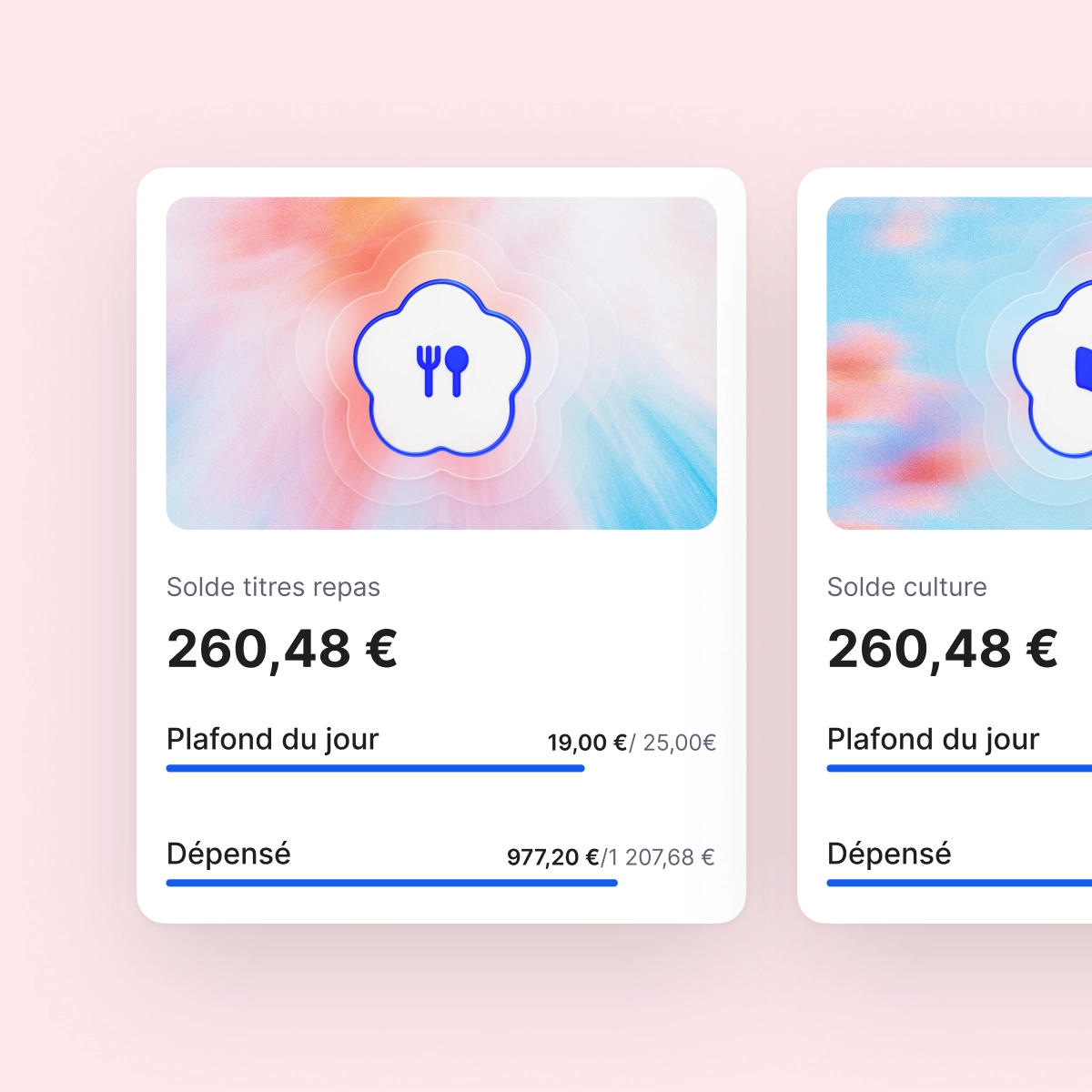
Mobile OCR receipt submission
Receipt submission is the highest-frequency interaction with the product. Every second of friction here compounds across a workforce. I designed a mobile OCR flow that does the data-entry work for the user. They snap, they confirm, they submit.
- Camera-first capture. Snap the receipt, OCR extracts amount, date, merchant, category. Manual edit available but optional.
- Confirmation as the primary interaction. The design optimised for the 90% case (one tap), with the 10% case (edit) gracefully accessible.
- Designed for one-handed mobile use. The entire flow works thumb-only.
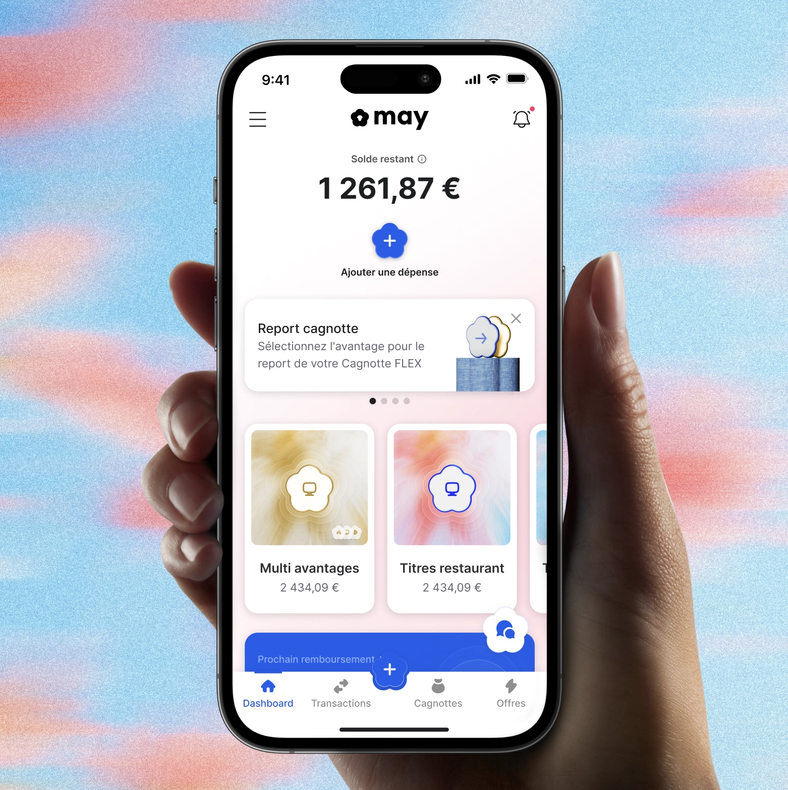
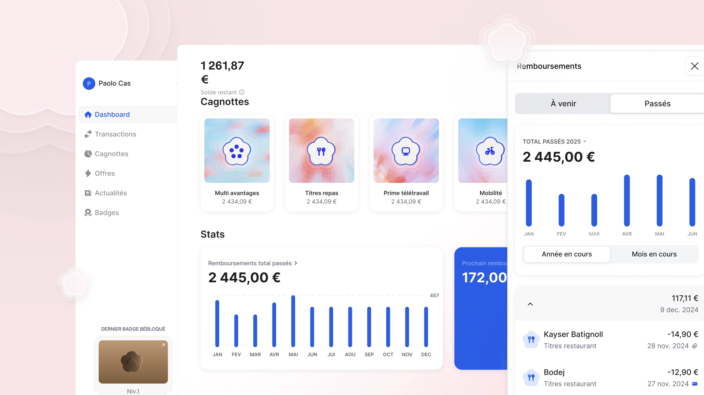
Admin dashboard redesign
The admin dashboard was the discovery surface for *new* benefits, but the existing version buried them. I redesigned the dashboard to make new benefits surfaceable, contextual to the company's configuration, and one-click adoptable.
- Promoted benefits surfaced in context. Only ones eligible given the company's setup are shown.
- One-click adoption flow. Adding a benefit takes a single confirmation, not a wizard.
- Adoption signal designed-in: what other companies of comparable size are using, so HR admins see decision support, not just options.
Company onboarding, fully re-imagined
The biggest piece of the engagement. Company onboarding was the make-or-break moment for adoption, and the existing version was a long form that asked HR admins to know what they often didn't.
The problem
HR admins were being asked to configure cagnottes, benefits, eligibility and budgets manually. Domain knowledge they often didn't have, on a tool they were evaluating in 20 minutes. Result: high drop-off, low first-week adoption, Sales burning cycles unblocking accounts.
The strategy
Replace the form with a guided journey that *auto-configures* cagnottes and benefits based on four inputs:
- Company size (headcount tier, drives default budgets and CSE applicability)
- Budget per employee per year
- Presence and type of CSE (compliance surface for French labour law)
- HR priorities (engagement / retention / cost-saving, drives benefit mix recommendations)
The decision
The product makes the configuration choice; HR admins validate or adjust. The design shifted from "you tell us what you want" to "here's what we recommend for a company like yours, change what doesn't fit." Adoption-led design, not configuration-led.
Collaboration model
- Product Managers, shaping problem framing, prioritisation and the cross-feature roadmap.
- Sales & CS, bringing the adoption signal from the field into every design decision. What was blocking deals informed what got redesigned.
- Engineering, close pairing on Bridge integration constraints, OCR accuracy trade-offs and dashboard performance. Specs handed off as design + acceptance criteria, not just screens.
Outcomes
- Bank-account onboarding rebuilt around Bridge with manual fallback. Drop-off reduced on the supported-bank cohort.
- OCR receipt flow shipped as the new default mobile submission path.
- Admin dashboard redesigned to make new benefits discoverable and one-click adoptable.
- Guided company onboarding rolled out. HR admins reach a configured state in minutes instead of hours, and Sales stops being a bottleneck.
Reflection
May taught me that in B2B SaaS, the design problem is almost never the interface. It's the *adoption model*. When the product takes a position on what the customer should do, the interface gets simpler and adoption gets faster. When the product asks the customer to figure it out, no amount of UI polish saves the funnel. That principle (design as opinion, not just affordance) is the one I now use to push back on briefs that start with "we need a better dashboard".